
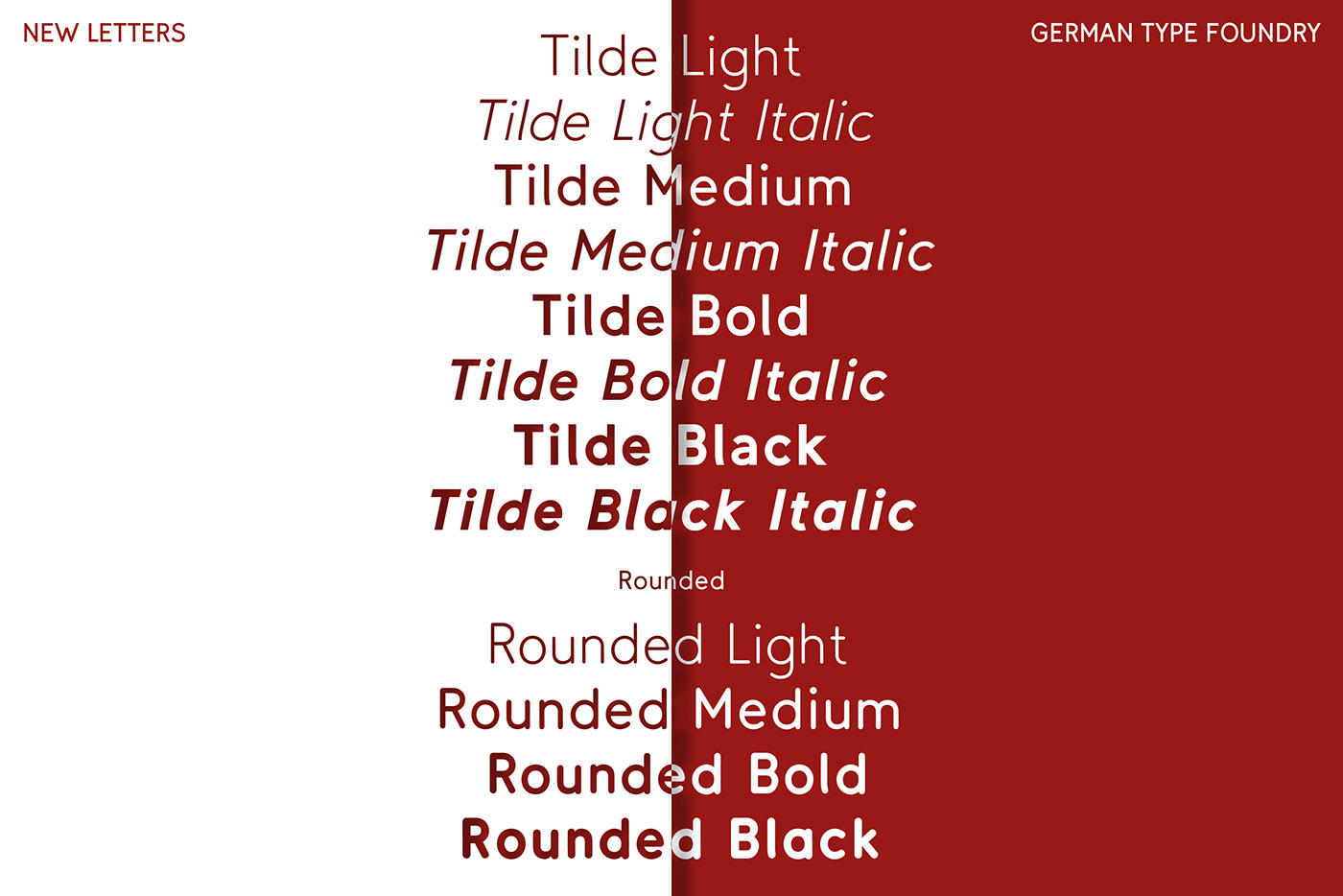
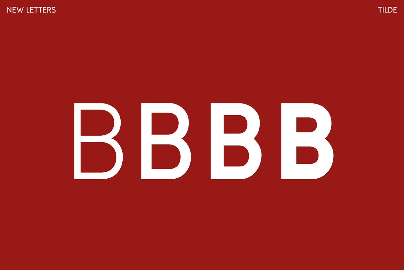
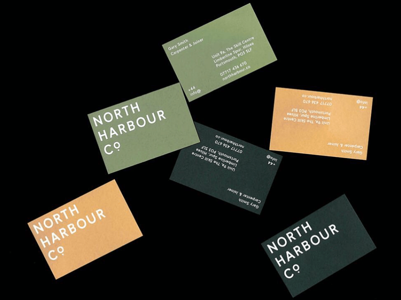
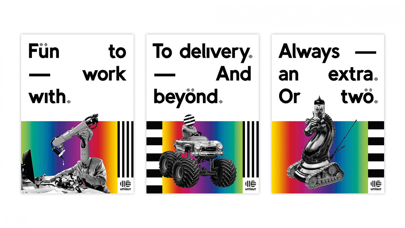
The constructed typeface Tilde was first released in the weight medium. The basic idea was to design a striking font that can be used primarily for short texts and headlines. In 2015 we have fundamentally optimized Tilde, extended it to 9 cuts and added the Rounded series. Afterwards the Black Series was added. With its basic geometric shapes the font reminds at classic sans serif fonts from the time of the constructivism. At second glance, idiosyncratic details and reveal fractures such as a l-angled, shortened Minuskel- and Majuskel-W, tapered V and M or beveled surfaces at E and F get shown up.







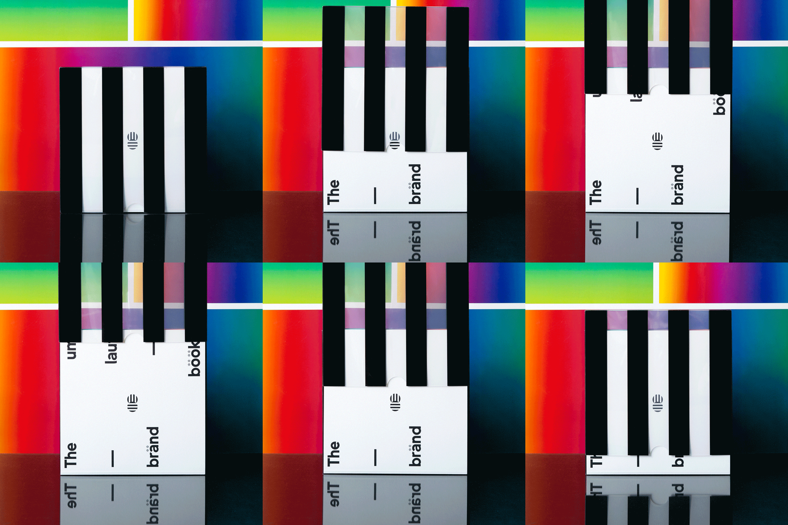
Designer: Armin Brenner, Markus John
Year: 2015
Styles: 12, Light, Light Italic, Regular, Italic, Bold, Bold Italic, Black, Black Italic, Rounded, Light, Rounded Regular, Rounded Bold, Rounded Black
www.new-letters.de

